
Quasar Admin Dashboard: Build One From Components
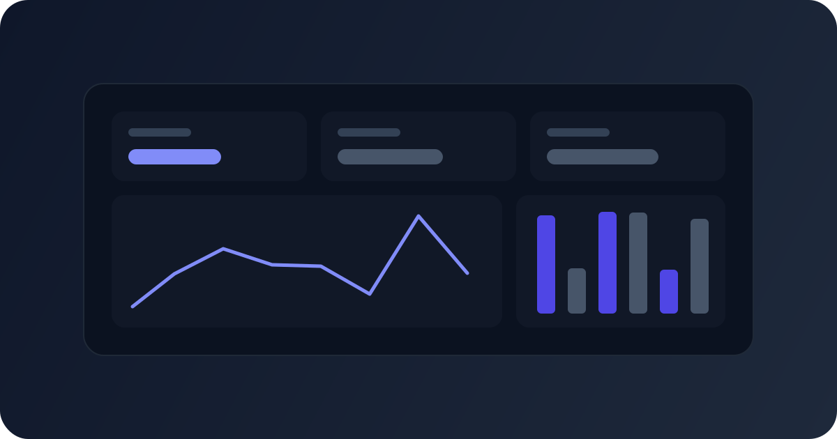
A Quasar admin dashboard is mostly three things on one page: an app shell with navigation, a row of stat cards, and a table of recent records. Quasar has a component for each (q-layout, q-card, q-table), and this post puts them together into one working screen that also holds up on a phone. At the end, we compare building it from Components with starting from one of the four dashboard Templates, so you can pick the route that fits how much of the app you need. The code targets Quasar 2.35.2.
The parts of a Quasar admin dashboard
| Part | Quasar pieces | Job |
|---|---|---|
| Shell | q-layout, q-header, q-toolbar, q-drawer | Navigation, account menu, page frame |
| Stat cards | q-card, q-icon, the grid classes | The four numbers people open the dashboard for |
| Recent records | q-table, q-badge | The list someone acts on |
| Side panel | q-card, q-list, q-item | Activity or tasks, next to the table on wide screens |
The shell used here is a stacked layout: navigation sits in the top bar, and the page content runs full width underneath. It's a good fit for dashboards with five to seven sections. If your app has dozens of sections or nested menus, a layout with a permanent sidebar drawer scales better. Both use the same q-layout, so the rest of this post applies to either.
A stacked layout shell
<script setup lang="ts">
import { ref } from 'vue'

const drawer = ref(false)

const links = [
  { label: 'Overview', to: '/dashboard', icon: 'dashboard' },
  { label: 'Orders', to: '/dashboard/orders', icon: 'receipt_long' },
  { label: 'Customers', to: '/dashboard/customers', icon: 'group' },
  { label: 'Settings', to: '/dashboard/settings', icon: 'settings' },
]
</script>

<template>
  <q-layout view="hHh lpR fFf">
    <q-header bordered class="bg-white text-dark">
      <q-toolbar class="q-px-md">
        <q-btn
          class="lt-md"
          flat
          round
          dense
          icon="menu"
          aria-label="Open navigation"
          @click="drawer = !drawer"
        />
        <q-toolbar-title shrink class="text-weight-bold">Acme</q-toolbar-title>

        <q-tabs class="gt-sm q-ml-lg" no-caps shrink active-color="primary" indicator-color="primary">
          <q-route-tab v-for="link in links" :key="link.to" :to="link.to" :label="link.label" exact />
        </q-tabs>

        <q-space />
        <q-btn flat round icon="notifications" aria-label="Notifications" />
        <q-btn flat round aria-label="Account">
          <q-avatar size="32px" color="primary" text-color="white">HJ</q-avatar>
          <q-menu>
            <q-list style="min-width: 160px">
              <q-item v-close-popup clickable to="/dashboard/settings">
                <q-item-section>Profile</q-item-section>
              </q-item>
              <q-item v-close-popup clickable>
                <q-item-section>Log out</q-item-section>
              </q-item>
            </q-list>
          </q-menu>
        </q-btn>
      </q-toolbar>
    </q-header>

    <q-drawer v-model="drawer" behavior="mobile" bordered :width="280">
      <q-list padding>
        <q-item v-for="link in links" :key="link.to" v-ripple clickable :to="link.to" exact>
          <q-item-section avatar>
            <q-icon :name="link.icon" />
          </q-item-section>
          <q-item-section>{{ link.label }}</q-item-section>
        </q-item>
      </q-list>
    </q-drawer>

    <q-page-container>
      <router-view />
    </q-page-container>
  </q-layout>
</template>
How it handles screen sizes:
- The tabs show from
mdup (1024px and wider) through thegt-smclass. Below that, thelt-mdclass shows the menu button instead. behavior="mobile"makes the drawer always act like a mobile drawer: hidden until opened, sliding over the page with a backdrop. It's only there for small screens, so it never takes space on a desktop.- CSS classes rather than
$q.screenin the template. With server rendering, the classes are right in the first paint, because the browser applies the media queries before any JavaScript runs. q-route-tabandq-itemwithtomark the active section from the current route.exactstops/dashboardfrom staying active on/dashboard/orders.
In Nuxt, this file is a layout (app/layouts/dashboard.vue) and <router-view /> becomes <slot />. In a Quasar CLI app it's a layout component in your routes.
A row of stat cards
Each card shows a label, a value and the change against the last period. Keep the cards data-driven, so adding a fifth metric is one line. Save this as StatCards.vue:
<script setup lang="ts">
interface Stat {
  label: string
  value: string
  change: number
  icon: string
}

defineProps<{ stats: Stat[] }>()
</script>

<template>
  <div class="row q-col-gutter-md">
    <div v-for="stat in stats" :key="stat.label" class="col-12 col-sm-6 col-md-3">
      <q-card flat bordered>
        <q-card-section class="row items-center no-wrap q-gutter-x-md">
          <q-avatar rounded color="primary" text-color="white" :icon="stat.icon" />
          <div>
            <div class="text-caption text-grey-7">{{ stat.label }}</div>
            <div class="text-h6 text-weight-bold">{{ stat.value }}</div>
            <div :class="stat.change >= 0 ? 'text-positive' : 'text-negative'" class="text-caption">
              <q-icon :name="stat.change >= 0 ? 'arrow_upward' : 'arrow_downward'" />
              {{ Math.abs(stat.change) }}% vs last month
            </div>
          </div>
        </q-card-section>
      </q-card>
    </div>
  </div>
</template>
q-col-gutter-md puts the gutter on the columns, so the cards keep equal widths: one per row on phones, two on tablets, four from md up. Format the values before they reach the card (Intl.NumberFormat for money and counts), so the card stays a dumb display component.
One design note: green for up and red for down only works when up is good. For metrics like churn or refund rate, flip the colors, or add an inverted flag to Stat.
The table and the side panel
The page puts the stat cards on top, then a table of recent orders next to an activity list. The table and the list share a row on large screens and stack below lg:
<script setup lang="ts">
import type { QTableColumn } from 'quasar'

interface Order {
  id: string
  customer: string
  total: number
  status: 'paid' | 'pending' | 'refunded'
}

const statusColor = { paid: 'positive', pending: 'warning', refunded: 'grey-7' } as const
const money = new Intl.NumberFormat('en-US', { style: 'currency', currency: 'USD' })

const columns: QTableColumn<Order>[] = [
  { name: 'id', label: 'Order', field: 'id', align: 'left' },
  { name: 'customer', label: 'Customer', field: 'customer', align: 'left', sortable: true },
  { name: 'total', label: 'Total', field: 'total', format: val => money.format(val), sortable: true },
  { name: 'status', label: 'Status', field: 'status', align: 'left' },
]

// sample data; load yours with useFetch or your API client
const orders: Order[] = [
  { id: '#1042', customer: 'Ada Lovelace', total: 129, status: 'paid' },
  { id: '#1041', customer: 'Alan Turing', total: 54.5, status: 'pending' },
  { id: '#1040', customer: 'Grace Hopper', total: 310, status: 'refunded' },
]
const stats = [
  { label: 'Revenue', value: money.format(48210), change: 8.2, icon: 'payments' },
  { label: 'Orders', value: '1,284', change: 3.1, icon: 'receipt_long' },
  { label: 'New customers', value: '312', change: -4.6, icon: 'person_add' },
  { label: 'Open tickets', value: '17', change: 12, icon: 'support_agent' },
]
const activity = [
  { text: 'Alan Turing placed order #1041', time: '5 min ago' },
  { text: 'Refund issued for #1040', time: '1 h ago' },
]
</script>

<template>
  <q-page padding class="q-gutter-y-md">
    <StatCards :stats="stats" />

    <div class="row q-col-gutter-md">
      <div class="col-12 col-lg-8">
        <q-table
          title="Recent orders"
          :rows="orders"
          :columns="columns"
          row-key="id"
          flat
          bordered
          :rows-per-page-options="[5, 10, 25]"
        >
          <template #body-cell-status="props">
            <q-td :props="props">
              <q-badge :color="statusColor[props.row.status]" :label="props.row.status" />
            </q-td>
          </template>
        </q-table>
      </div>

      <div class="col-12 col-lg-4">
        <q-card flat bordered>
          <q-card-section class="text-subtitle1 text-weight-bold">Activity</q-card-section>
          <q-list separator>
            <q-item v-for="item in activity" :key="item.text">
              <q-item-section>
                <q-item-label>{{ item.text }}</q-item-label>
                <q-item-label caption>{{ item.time }}</q-item-label>
              </q-item-section>
            </q-item>
          </q-list>
        </q-card>
      </div>
    </div>
  </q-page>
</template>
QTableColumn<Order> types the column definitions against your row type, so a typo in field is a compile error. The #body-cell-status slot replaces only the status cell. Every other cell keeps the default rendering, with format applied. Sorting, search and server-side pagination are their own topic; the table here is deliberately small.
That's a complete, responsive dashboard page: on a phone you get a menu button, one stat card per row and the table above the activity list; on a desktop, tabs in the header, four cards in a row and the table beside the activity list.
Building it from QuasarUI Components
The code above is plain Quasar, and you can stop there. If you'd rather start from designed parts, these Blocks map one to one onto the sections:
- Stacked Layouts: 7 layouts, 2 of them Free. Each is a
q-layoutwith the navigation in the header, a menu button belowmdthat opens abehavior="mobile"drawer, an account menu, a page title bar and an empty content area for your page. The variants differ in the header: light or dark, primary-colored, withq-tabs, or with a search field. - Stat Cards: 14 designs, 2 of them Free. The first matches the card above, with an icon, a value, a percent change and a "View all" footer. Others add goal progress with
q-linear-progressbars. One of them is a Themeable Component that follows your Theme Builder colors. - Data Tables: 17
q-tabledesigns, 2 of them Free, for the recent-records part.
Copy the shell, drop the stat cards and a table into its content area, and swap the sample data for your API. Every Free Component can be copied without signing in.
Components or a dashboard Template?
Components give you sections. A Template gives you the whole app.
| Build from Components | Start from a Template | |
|---|---|---|
| What you get | The layout, cards and tables you pick | A full multi-page admin app, delivered as a private GitHub repo |
| Pages | The ones you assemble | Dashboard, reports, tasks, kanban and more, already built |
| Charts | Bring your own | Included |
| Dark mode | Per Component | Across every screen |
| Best when | You have an app and need a dashboard screen in it | You're starting the admin app itself |
QuasarUI has four dashboard Templates, all with light and dark screens:
- Rambo: analytics charts, task management with an advanced data table, a chat page.
- Avocado: a clean, basic dashboard with analytical cards and charts.
- Minimal Dashboard: minimal styling with micro-interactions, 8+ pages, reports, tasks and kanban boards.
- Data-Focused Dashboard: three chart types for analytical cards, plus reporting pages for chart-heavy apps.
Common questions about Quasar admin dashboards
Should a dashboard use a sidebar drawer or top navigation? Top navigation (a stacked layout) for a handful of sections; a permanent sidebar when the menu is long or nested.
How do I make the drawer only appear on mobile? Show the menu button with the lt-md class and give the drawer behavior="mobile", as in the shell above.
How do I keep stat cards the same height? Put them in a row with q-col-gutter-*, and add full-height to the q-card if their content differs in length.
Can I use these with Nuxt? Yes. The shell becomes a Nuxt layout and each section a component in app/components/.
Next step
If you're building the admin app itself rather than one screen, see the four dashboard Templates: each one is a complete Quasar admin app with light and dark mode, delivered as a private GitHub repo. Open a live preview of each before you decide.